Setting the perfect white text
![]() Posted by Marco on May 3, 2009 in
INDD
Posted by Marco on May 3, 2009 in
INDD
Putting white text on a colored background? We’ve all done it. Oh, it looks great on your screen. But when you receive the printed artwork it doesn’t look all that good. If you look closely you can see the white type is a bit blurry, almost like something took a lot of little bites out of the type. This not-so-sharp phenomenon is due to the offset printing process and the way color is replicated (using halftone dots). But there is an easy way to reach much higher quality – and better readable – type. It requires almost no effort and all you need is InDesign. Take a look at these screenshots and extreme close-up photo’s.
In InDesign select all your white text and add a 0.1 point stroke. The trick is to make sure the stroke uses a CMYK-color that is 100% of either Cyan, Magenta, Yellow or Black. Of course it can’t just be any of those four colors. It needs to be one of the colors you also used to build your background-color. Suppose you’ve got white type on a dark-red (C=0/M=90/Y=100/K=30) background: You simply add a 0.1 stroke of 100% magenta. This very small 100% Magenta stroke will be almost invisible to the naked eye but it will help your printer create much nicer white type because the white and 100% magenta will create a nice and sharp ‘edge’.
In the final Certified PDF the small stroke will look horrible but as long as you make sure it is only 0.1 point of only one color there won’t be any problems. Take a look at these extreme close ups.
#1: In the PDF the stroke is highly visible:

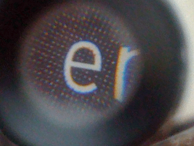
#2: If you check the final and printed artwork there’s no problem and the white text got printed very good.
#3: A thin magenta stroke on a red background (cPDF):

#4: The printed artwork: Great white text.

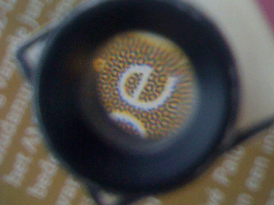
#5: One last close up: Brown is always a difficult color because is is created using a percentage of Cyan, Magenta, Yellow and black. The white text is in danger of getting ‘eaten’ by all four colors. I’ve added a 0.1 black stroke and you can see most of the letter ‘e’ made it. A few small ‘dots’ of some colors made it past the 0.1 black stroke but most of them were stopped by the manual trapping.

Comments
#1 Matt Beals | May 15, 2009 | 07:42 CET
How did you photograph through the loupe? What equipment did you use?
#2 Marco Kramer | May 15, 2009 | 07:45 CET
Hey, Matt! Nothing fancy. A iPhone was all it took…
#3 Matt Beals | May 15, 2009 | 07:47 CET
And here I thought you were going to have a camera connected to a loupe or a super macro lens. Or something fancy… I guess simplicity wins!