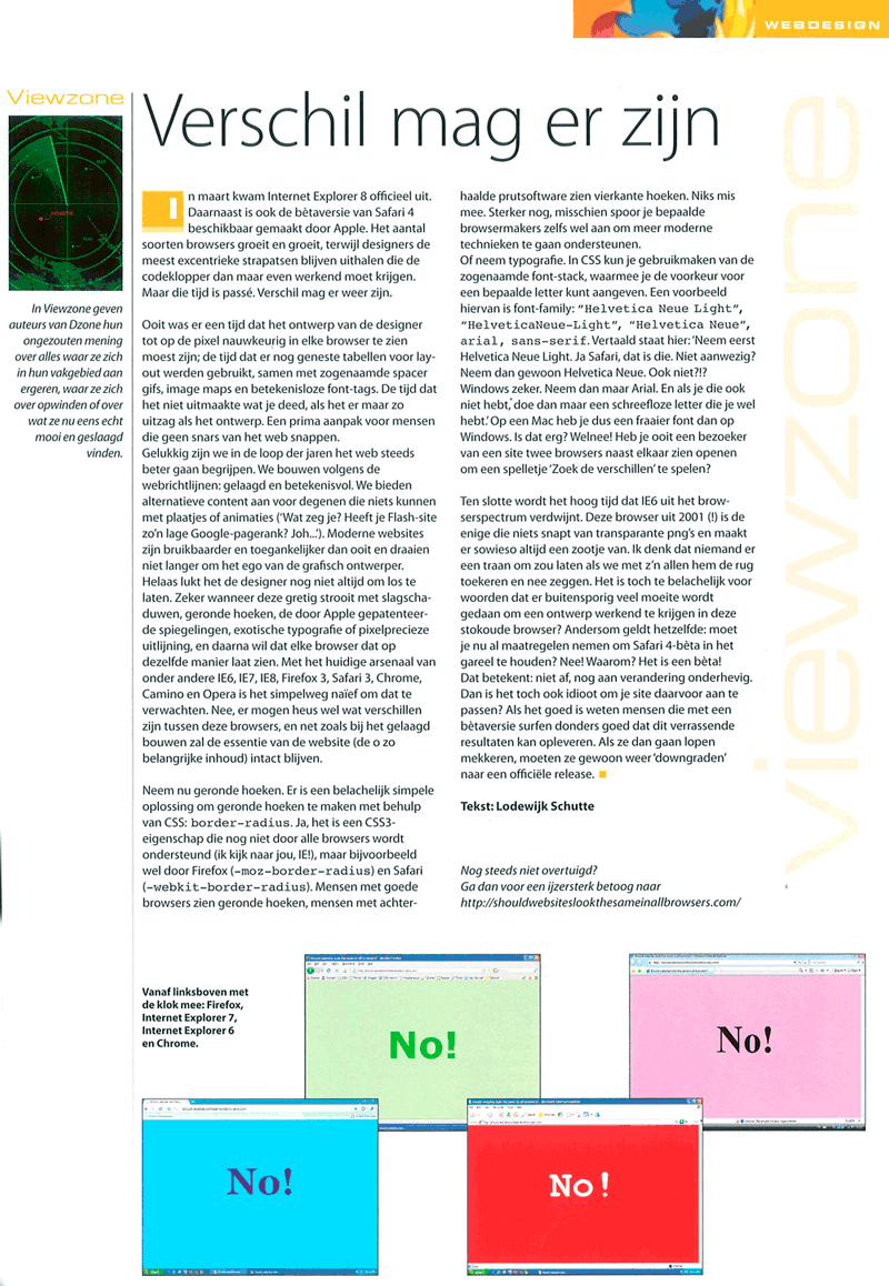
You might want to press that ‘Refresh’ button
![]() Posted by Marco on Jun 15, 2009 in
DE
Posted by Marco on Jun 15, 2009 in
DE
Well I was afraid this might happen… Apple decided not to fix Safari’s bad text-rendering. When the Safari Beta first came out it proved to render light colored text on a dark background just terrible. And that’s just what the design of this site uses for it’s main navigation and it’s footer text. This problem had my full attention because 64% of all visitors use Safari (Firefox usage is 25% and Internet Explorer is stuck at 7%). Of course I talked about this with my number one front-end developer Low. We decided to wait until Apple would reveal Safari 4. It didn’t feel right to start adjusting the CSS of this website for a Beta browser with a bug. (And I couldn’t believe Apple would actually not fix this rendering issue). Well… Safari 4 is here and the rendering of light text on dark background is still terrible. At least we knew how to fix it. The issue had been noticed by other webdevelopers like Komodo and Sam brown. There were a few things with Digital-Engineer.net that made this hack extra important. Little did I know it would also make it’s way to a column in the Dutch D-Zone Magazine.
I make extensive use of the Helvetica Neue Light for the body, the heading and other parts of this webite. My font-stack (pdf) is composed like this: “Helvetica Neue Light”, “HelveticaNeue-Light”, “Helvetica Neue”, arial, helvetica, sans-serif. It basically tells your browser how to show the type. It first asks for the Helvetica Neue Light and keeps ‘dumbing it down’ until finally it asks for any old sans-serif if your browser fails to recognize all of the above font-families. Mind you, you can only ask Mac users for a HelveticaNeue because it’s not a standard system-font for the Windows OS.
And that’s the entire philosophy. Why would I not render the text in the beautiful Helvetica Neue? I certainly don’t feel every browser(version) or operating system should render a website exactly the same. Why should I not show some clean typography to Mac users? There’s already so much Arial out there… Digital-Engineer.net will still be perfectly readable –even if you’re using a 10 year old browser– or if you decide to turn of all images, but I don’t feel everyone has to view ‘a dumbed down’ version just because Internet Explorer can’t handle certain CSS or a specific type. Of course back then I didn’t know 77% of my visitors would be using a Mac. Those numbers made me feel even better about providing a better user experience for Mac. (Safari 4 visitors still might need to press that ‘Refresh-button’ by the way).
And that D-Zone article I was talking about? You can read a large scan of the article if you click the image. (With permission from the author and in Dutch only, sorry guys). Scan D-Zone artikel (pop-up).

Comments
#1 Low | June 15, 2009 | 21:46 CET
You know, the whole Safari-text-rendering thing isn’t even a bug. Safari, or to be more precise: the webkit rendering engine, is the only engine that renders font-weight correctly. This property in combination with the font stack will deliver different results throughout different rendering engines, like Firefox’ gecko, IE’s trident, Opera’s presto and Safari’s (and Chrome’s) webkit.
Given a font-family like ‘Helvetica Neue’ and a font-weight set to 100, the font will be rendered as Helvetica Neue UltraLight. 300 will be Light, 500 will be Regular, 800 will be Bold. Give or take, of course.
Of course, the light text on dark background thing can still be improved with some text-shadow magic.